

Which Colour is Right for your Business? Analyzing the Meaning behind 9 Popular Colours
/
Imagine that two new restaurants open up near your house. The menus and prices are nearly identical; the only discernable difference between the two is the colour of their logos and interior. One uses a subtle, warm burgundy colour on its menus and walls, highlighted by soft lighting throughout. The other opts for a dark, murky green colour and fluorescent lighting. Which restaurant would you be more likely to try first?
Or imagine a new men’s clothing store opens in a mall; its clothes are the epitome of style, with sharp-looking blazers, suits and jackets adorning the walls. In contrast to the dark blacks, browns and greys of their clothing, the store decides to use neon pink on its logo and advertising. Do you think the store would easily be able to attract its target customers?
While the examples above are extreme, they serve as proof that colour clearly has an effect on us. For both businesses and designers, the importance of understanding the psychological effects of colour—how it affects their customers' moods, behaviours and decisions—cannot be understated.
According to the 2006 study Impact of Color on Marketing, people typically judge a product within 90 seconds of their initial interaction, and up to 90% of this assessment is based on colours alone. That's huge.
When you think of the world’s most popular brands, what comes to mind first? More than likely, you’ll imagine their logos and marketing materials, more specifically their colour – Starbucks’ green, Ikea’s yellow and blue, or perhaps Apple’s sleek grey. The most successful businesses know that colours convey immediate meaning for those who view them, and so they take the time to choose a colour palette that will appeal directly to their target audience. They know that, often subconsciously, colours affect how consumers see the personality, professionalism, and even trustworthiness of a brand.
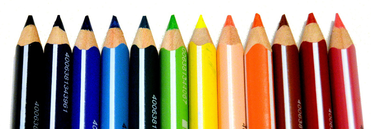
It is important to realize that individual experiences mean nobody looks at a colour quite the same way. With that said, much research has been done into colour and its effects, and the following observations are generally accepted:

Red can symbolize passion and love (hence it’s excessive use every February 14th), but also aggressiveness and anger. Bright reds scream “energy”, and have actually been shown to increase blood pressure and stimulate our adrenal glands. Looking at red also makes us hungry, a likely reason why McDonald’s, Burger King and Wendy’s all incorporate it into their logos and marketing. Red grabs people’s attention immediately, thus it’s no surprise thieves often target red cars. Famous red logos: Coca-Cola, Red Bull, Target

Blue can have the opposite effect: it’s calming and relaxing, and has actually been shown to help those suffering from insomnia. Companies that use blue are seen as loyal, established and trustworthy, which is a main reason why it is so prevalent in the business world. People experiencing sadness and depression are said to have “the blues” due to their lack of energy and extreme calm feelings. If you’d like to lose weight, stare at blue for a while – other than blueberries, the thought of blue food just isn’t that appetizing. Famous blue logos: Pepsi, IBM, Wal-Mart

Like blue, green is soothing and can help promote physical equilibrium. However, greens can have drastically different effects depending on which shade is used: light green can provoke feelings life and renewal, while dark greens can remind us of death, decay and sickness (remember those old cartoon characters turning green when they weren’t feeling well?). Green is becoming increasingly popular in design due to the rising popularity of eco-friendly and organic products. Famous green logos: BP, Starbucks, Carlsberg

Orange is one of the more playful colours, and can symbolize creativity and youthful enthusiasm. Interestingly, despite its close relation to red (the energetic, angry colour) it has been shown to stimulate positive emotions and relieve depression. Some research into its physiological effects shows that it stimulates sexual organs, however I wouldn’t recommend wearing a bright orange suit on a date unless your name is Jim Carrey. Famous orange logos: Harley Davidson, Nikelodeon, Tide

Yellow is slightly less popular than some other colours, but it does have a few fans (particularly those who enjoy bananas). It can symbolize caution – think streetlights and road signs – but also playfulness and warmth. It’s been said that babies have an instinctive fear of yellow because it makes them think they’re in the sunlight (and those rays can be harmful!). Famous yellow logos: McDonald’s, Best Buy, Shell

Pink is usually regarded as the most feminine colour, and invokes feelings of innocence, romance and tranquility. It’s used primarily in products marketed towards girls and women, and has become associated with breast cancer awareness. Famous pink logos: Barbie, HMV, Victoria’s Secret

Although often viewed as a feminine colour as well, purple has been worn by many kings of the past who would likely throw you in a dungeon if you dared to call them “girly”. It symbolizes royalty, luxury and sophistication. It can also be mysterious, which is perhaps why it’s immensely popular with cape-wearing magicians. Famous purple logos: FedEx, Hallmark, Cadbury

Brown has its place in companies who want to be seen as simple, down-to-earth and secure. UPS is perhaps most famous for using brown, and even included the colour in a former advertising slogan – “What can Brown do for you?”. Chocolate and coffee companies commonly use brown as well. Famous brown logos: UPS, Bernard Callebaut

Black, while technically not a colour, is one of the safer choices due to its tradition and simplicity. It can be bold, authoritative, or even elegant, but can also represent death. Famous black logos: Nike, Adidas, Revlon
For designers and businesses, it’s crucial to take the above characteristics into account when deciding on a colour palette. Colour can be a powerful tool when used correctly, and can go a long way in attracting a targeted audience.
How important do you think colour is to the success of a business? Which businesses do you think have been successful (or not successful) in their colour choices? Why have you chosen to use certain colours for your business? Please leave your comments below.